

In this new post we will analyze the differences among the countries that took part on #museumweek, and we will draw some conclusions about the difference in behavior patterns.
We will start by showing the network of interactions of all the profiles that used the hashtag #museumweek.
fonte:http://blog.lamagnetica.com/2014/04/24/museumweek-3-a-closer-look-to-the-country-groups/
@edisonmariotti - #edisonmariotti #mais60melhoridade

In order to have a clearer visualization of this network, we are going to apply the same filters we used in our previous post. Despite the simplification in the graphic layout, the numerical analysis is performed over the whole data set in order to achieve more reliable insights.
This will let us have a more compact graph, which includes the most active profiles and can be displayed in our computer screen:

Country groups
Crossing the modularity’s information (ie. groups) with the information Twitter provides about each user’s language we have been able to categorize a 73.4% of the core graph profiles. Remaining profiles are from other countries or we haven’t been able to classify them with the analyzed data; we have to take into account that Twitter does not have this information for all profiles.
First, we are going to see the total users per country, and its percentage among the total number of profiles analyzed:

This chart confirms what we already saw in the visual analysis of the network in previous posts: almost half of the profiles who have tweeted using the hashtag #museumweek are British, while the rest divides uniformly between Spain, Italy and France.
We will show close up views of each country group a graph for each one of the countries:

British Community MuseumWeek
Here you have a high-resolution image of the graph: Download

Spanish Community MuseumWeek
Here you have a high-resolution image of the graph: Download

Italian Community MuseumWeek
Here you have a high-resolution image of the graph: Download

French Community MuseumWeek
Here you have a high-resolution image of the graph: Download
Differences between countries
A very interesting datum that will help us understand the structure of each group is the average distance within profiles of each country. Distance between two users is the minimum number of links that we have to go through in order to go from one point to another. The average distance within each country group will serve us as an indicator of the degree of interconnection between different profiles.
The following table summarizes this information:

It is interesting to realize that United Kingdom, the country with more contestants in this initiative is, at the same time, the country with the highest average distance between users, with a major diameter. It is an expected result: the more a graph grows, the more the values are likely to increase.
The other 3 countries, with groups of 4.500 – 5.000 users, let us observe:
Italy is the most compact group; with a reduced average distance (3.8) and a diameter of 9.
France follows with a 3.9 and 11, respectively.
Spain has larger numbers, both in the average distance and diameter, and also in #museumweek participants: 5.100 by 4.500 of Italy and France.
It is worth noting the participation and connections of France and Italy, because these are countries whose museums have not been very active on Twitter until now. This can be seen on the study of the worldwide museum’s interaction on Twitter, where Italy’s group almost didn’t exist, and the French one was very small, despite having some world class museums, including the Louvre, the most visited museum worldwide.
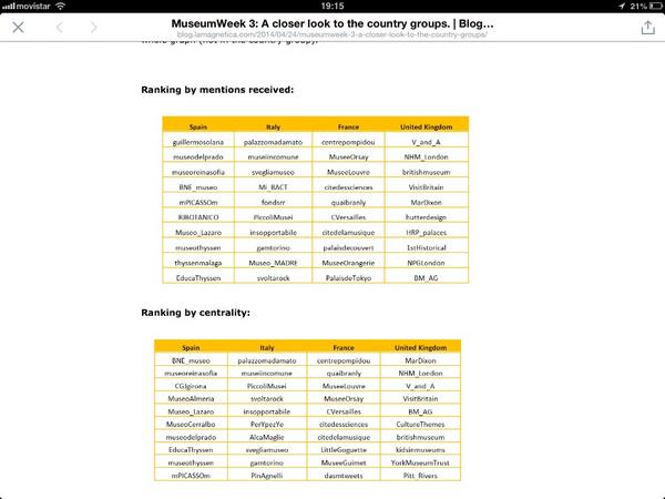
Main Users by Country
We are now going to take a look to the most relevant users by country. As we did in other #museumweek articles, we use two criteria to assess the relevance: mentions received and centrality (connection’s degree of a user with the rest of the network). The second one is more reliable when looking to the relevance a user has had in the #museumweek talk, its place in the whole graph (not in the country group).
Ranking by mentions received:


Nenhum comentário:
Postar um comentário